

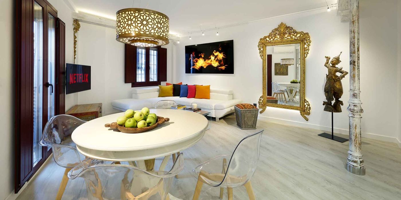
Walk into a room painted deep blue and you may feel calmer, while a room in bright red can feel energising or even tense, and psychologists say this is no coincidence, since colour shapes mood in quiet, measurable ways. Researchers have found that cool colours such as blue and green tend to lower heart rate and promote a sense of calm, which is why they appear so often in bedrooms, hospitals and offices. Warm colours such as red, orange and yellow tend to raise arousal, making people feel more alert, hungry or excited, which is why fast-food restaurants and sale signs favour them. The effects are partly learned, since we associate colours with nature, from the green of a forest to the blue of a clear sky, and partly cultural, since the meaning of a colour changes from place to place. Yet the basic pattern, that colour changes how a space feels, holds across many studies and many countries.
What the Evidence Shows
Experts say the practical lesson is to choose colours with the purpose of the room in mind, rather than by habit or fashion alone. They suggest soft blues and greens for bedrooms and study spaces, warm neutrals for living rooms where people gather, and brighter accents where energy is wanted, such as a kitchen or a children’s playroom. Designers also warn that the effect depends on light, since a colour that looks calm in daylight can feel heavy in a dim room, and that personal taste matters as much as any rule. Studies of workplaces have found that workers in rooms with a touch of green or blue report feeling calmer and more focused, while plain white walls can feel stark and tiring. For anyone redecorating, the advice is simple: paint a sample, live with it for a few days, and notice how the room makes you feel, since the colour you choose will be quietly shaping your mood every day. Reporting and analysis from sources such as American Psychological Association track the same developments, and specialists following the quiet influence of colour say the direction is now consistent across independent lines of evidence.
The Wider Context
The wider context is a discipline rebuilding confidence through replication and pre-registration, and findings on the quiet influence of colour are being reported with their effect sizes and limits attached. That honesty can make results sound smaller than the headlines of a decade ago, but the effects that survive are the ones practitioners can responsibly build on.
What Happens Next
What happens next in research on the quiet influence of colour is a turn toward real-world trials: longer, larger and conducted in the schools, workplaces and clinics where the findings are meant to apply. Psychologists are also studying individual differences more seriously, because average effects conceal the people for whom an approach works powerfully and those it leaves cold. Both shifts make the science slower and more useful. You can follow related developments in our coverage of psychology.
There is a practical lesson in all of this for readers deciding what to do today. Start with the verified facts, be wary of anyone promising certainty, and prefer reversible steps while the evidence is still developing. Circumstances differ by country, income and personal situation, so general guidance should always be weighed against your own context before you act on it in any significant or lasting way.
